
1. The Harley Davidson logo is basic, original, but cool. No matter if you see just the shield, you still know what it is. The colors are awesome. They stand out on one another. I researched and found the orange color stands for cheerfulness and energy while the black stands for excellence and elegance of the company. I want my logo to have the same feel! Any biker would know what this logo is whether it be from close up or far away and that's the goal of my logo as well.

2. The Polaris company is widely known as well, but more for snowboarding and ATV's. They do sell some motorcycles too. It's very simple. I don't know if I like the colors and if i saw that circle with the start in it, I wouldn't be able to tell what it is without the name. So I wouldn't say their logo is effective by any means to bikers.

3. Honda Performance is another company that sells motorcycles and motorcycle parts. I don't know for sure if this is the same as the Honda dealerships with the H logo, but this logo is cool too. The wings stand for fast performance which makes sense because it's for a performance bikes and not luxury cars. I don't think this logo is effective to the means of my companies audience.
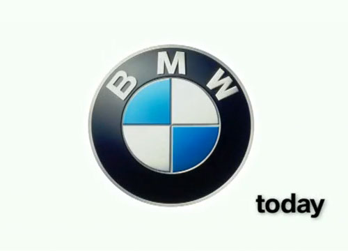
4. BMW sells motorcycles too, but mainly crotch-rockets. So it's along the same lines as a motorcycle company.
According to this website, "the logo shows a propeller in motion with the blue part representing the sky. This is due to the company’s role of building aircraft engines for the German military during World War II." So that is pretty neat. Same concept applies here, that I don't think this logo if effective for bikers.
 5. And the last company is cycle exchange here in Tampa. They aren't that popular so I just searched for motorcycle dealerships in
 Florida
and this one popped up so I figured I'd use it since it's along the lines of what I'm doing. The logo is plain and alright. I notice the cycle symbol which probably means to recycle because their motto
is "buy here, save here." So it's kind of creative and cool. This logo could be effective
for people who are looking for a used bike just to start off with, but probably more towards the younger crowds just starting out. Not towards the old folks like my parents.
No comments:
Post a Comment